Made the world's hardest number legible to a ten-year-old
- Reader rating
- Average reader rating
- Recognition
- European Design Awards 2024
- Learnt directly from
- Mentor and lead designer
4.8/5
Silver
Valentina D'Efilippo
- Role
- Information architecture designer · Illustrator
- Timeline
- Q2 2022 · Q3 2022
- Team
- Valentina D'Efilippo, mentor and lead designer · 1 Researcher
- Tools
- RAWGraphs · Excel · Adobe Fresco · Illustrator · Photoshop
- Status
- Printed (2023)Learn more
Context
The reader is ten, curious, and meets a chart here first.
Infographica meets a ten-year-old already asking the world's bigger questions — about time, size, distance, inequality, animals, weather. Every spread teaches the visual vocabulary they need to read the answer in a chart.

Challenge
Translate a statistic into a story without losing the statistic.
A ten-year-old gives a page about ninety seconds. In that window every spread had to land three things at once: a real statistic in a real chart, a story the reader could hold, and the chart-grammar an adult would meet — trusted to a ten-year-old at full strength.
Aristotle named those three appeals — logos, pathos, ethos — for arguments made in speech. Every Infographica spread is the same argument made in print.

Logos
What is the story in this data?
Tested chart types in RAWGraphs against the dataset — spotted the outliers, the trend, the main shapes, and chose the chart that revealed the most interesting story for a kid.
Pathos
What would surprise a 10-year-old?
Looked for the analogy, the colour, the hook that made the statistic land — time as a river, skin as a blanket.
Ethos
How do we make this clear and let them dive deeper?
Visual comparisons, keys, callouts and how-to-read scaffolds — the reader gets the right read at a glance, and the layers underneath if they want them.
Solution
Three ingredients that made each page work.
Every spread that landed shared three ingredients — none alone, all three at once.
Ingredient 01
Honour the data.
Honouring means letting the chart type follow the data. For the Meteors spread, that meant testing the same dataset in RAWGraphs across several chart types and choosing the one that surfaced the real pattern of frequency, scale, and distribution. Reading the spread teaches the kid the chart's grammar at the same time they learn the facts about meteors.

Ingredient 02
The page becomes the graph.
On the Selva spread, the illustration is the chart. The trees, the layers, the canopy carry the data — read the forest and you've read the statistic, with no second translation step from picture to graph.

Ingredient 03
Earn the wow.
The Time spread treats the page as a ten-year-old's ninety-second window and mobilises every resource to turn it into a discovery — colour, scale, illustration density, callouts, fun-fact bubbles, the river-as-time analogy. Time is the abstraction that needed all of them at once.

Behind the scenes
50 spreads · 3 months
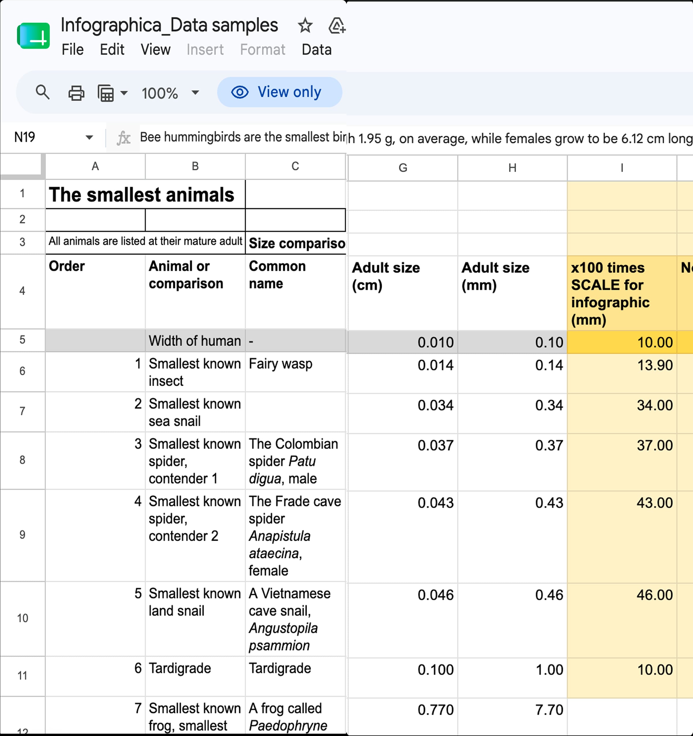
Data review and analysis
Excel
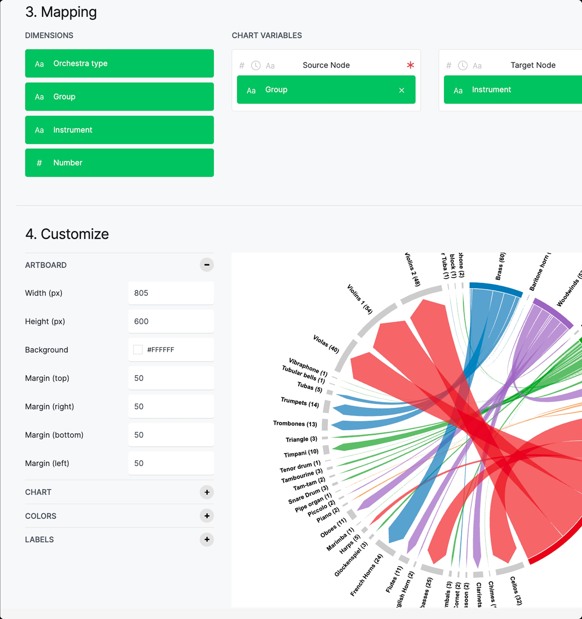
Data experimentation
Rawgraphs, Excel
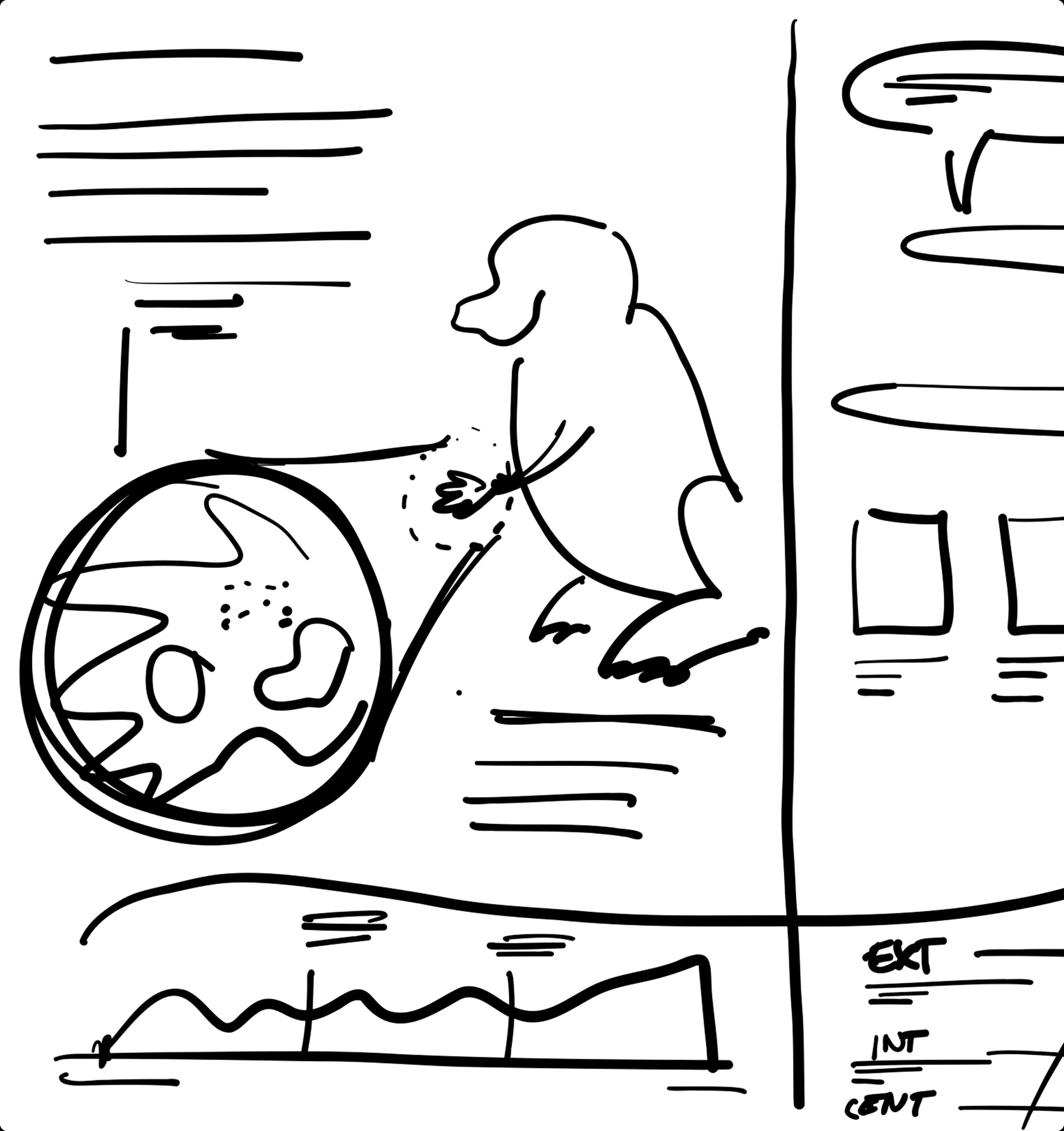
Sketch
Pen + Paper
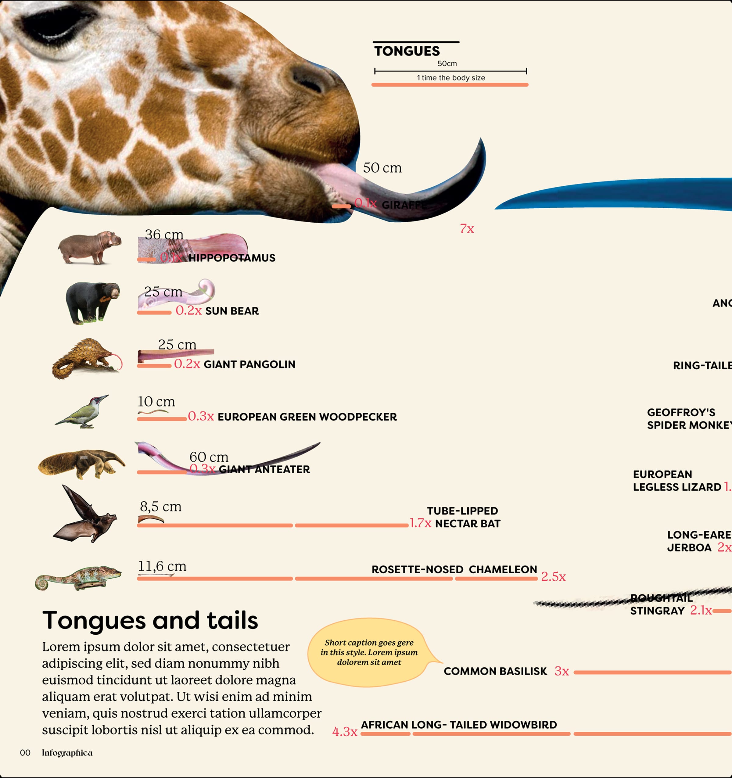
Main layout
Illustrator
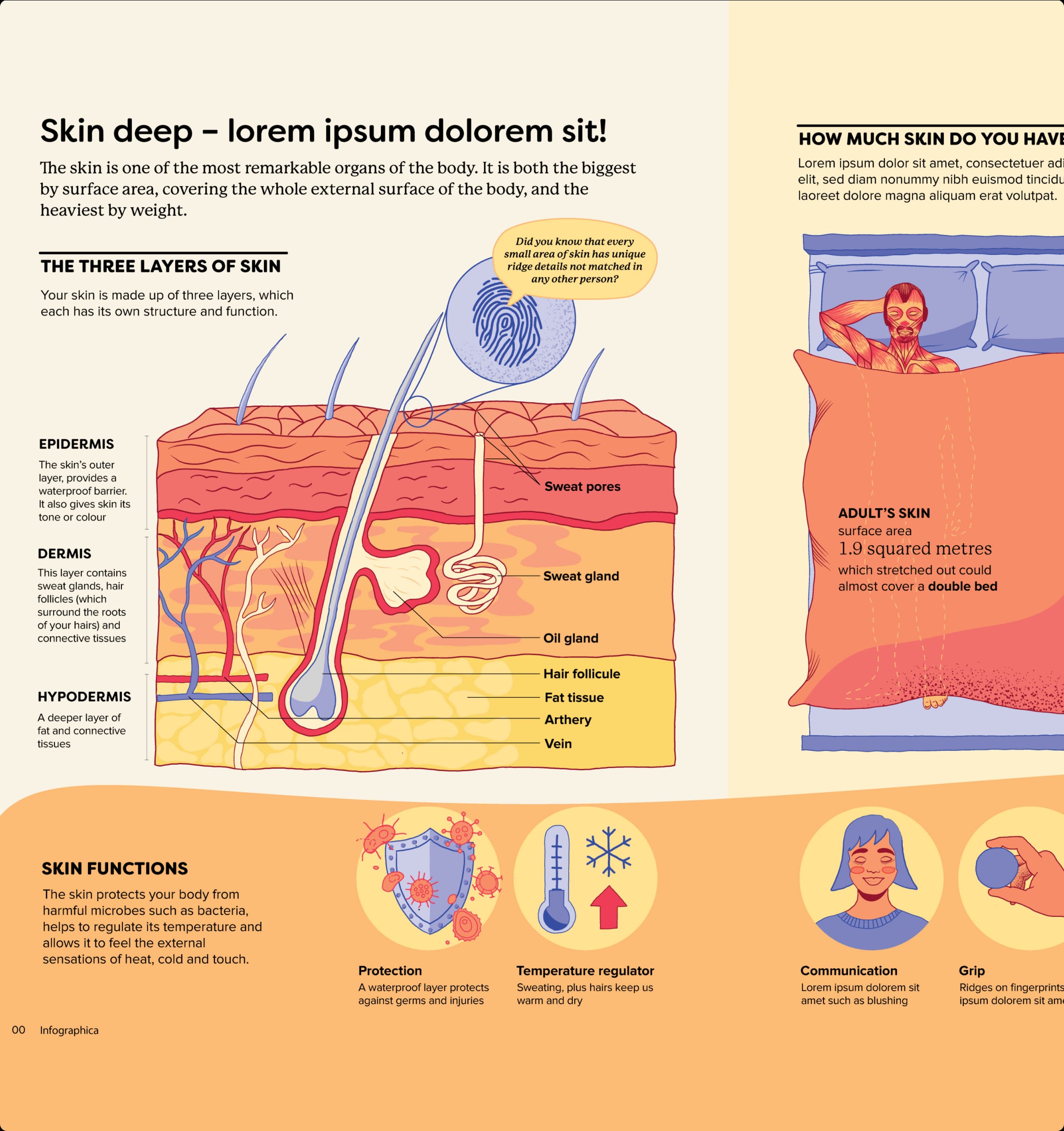
Illustration and refinement
Fresco + Illustrator


A treasure trove of sparkling facts… absorbingly informative.
— Daily Telegraph
Other projects